Case Study
District’s Pencil Logos Point to Preparation
Clients: Education
Services: Branding and Communications, School Communications
Back-to-School Design Evolves Into Flexible Graphic
THE SITUATION
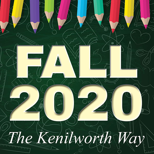
Working with Laura Bishop Communications, Kenilworth Public Schools created a number of reopening materials ahead of the 2020-2021 school year. LBC designed a “Fall 2020” logo to anchor information about health protocols, scheduling, academic plans and more. But by September, district leaders wanted a hashtag or tagline that could carry through the year and reassure the school community about its preparation. Of course, another graphic would be a bonus.
THE STRATEGY
LBC continued the brand recognition from the “Fall 2020” logo by plucking a pencil used in the original design. An individual pencil, set against the same green school-themed background, became a flexible graphic to promote the new #KenilworthReady tagline. The year began with a bright yellow pencil that read “#KenilworthReady for September,” and expanded to messages such as “#KenilworthReady to Zoom!” and “#KenilworthReady for Innovation.”
THE WIN
In a year when technology was essential, Kenilworth got a lot of mileage out of an old-school pencil that evolved from an existing graphic. The district earned kudos from parents and teachers for its consistent, clear and positive communication. The #KenilworthReady messages helped provide much-needed reassurance.


