Case Study
Logo and Collateral Designs Help Launch Program
Clients: Nonprofit
Services: Branding and Communications Campaigns

Distinctive Branding Brings Project to Life
THE SITUATION
When the Cape Regional Recovery Center was gearing up to launch a new program dedicated to improving the health, safety, and financial security of fishermen and their families, they called upon Laura Bishop Communications (LBC) to help establish a distinctive, recognizable brand.
THE STRATEGY
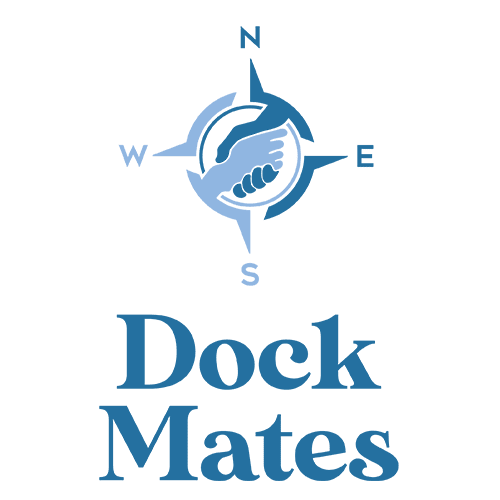
Logo design was the first step in branding this new program, Dock Mates. LBC worked to develop several ideas tied to nautical themes and imagery. After a few rounds of refining and editing, the final design included a nautical compass that incorporated two hands touching, a symbol of outreach and help.
With a logo now secured, LBC wrote copy to describe the program and its features, including coining the phrase “navigator” to describe the Cape Regional Recovery Center staff members who would be walking the docks and connecting with fishermen and their families to match them with services fitting their specific needs.
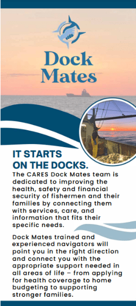
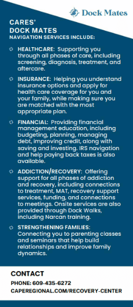
Collateral was created for quick distribution that outlined the program and the different areas Docks Mates could help this population “navigate.” LBC led the creation of a rack card featuring the logo, concise details about the program, contact information, and photos from actual Cape May commercial fishermen.
THE WIN
Cape Regional Recovery Center has used the Dock Mates logo on coffee cups and other materials, helping reinforce brand recognition in the community. The rack cards are handed out weekly during “dock walks” and can be found in the County Prosecutor’s Hope One addiction outreach van, and at other county agency offices.


